
Color trends are significantly impacted by the situation of the globe. So it’s no wonder that at a time of growing prices, global wars, and ecological crises, we’re seeing a collective longing for escape and distress conveyed via color. Color helps us express our visions, ambitions, and feelings.
This year, we’re witnessing a trend towards honest, no-nonsense branding, as well as a strong emphasis on emotional connections with customers.
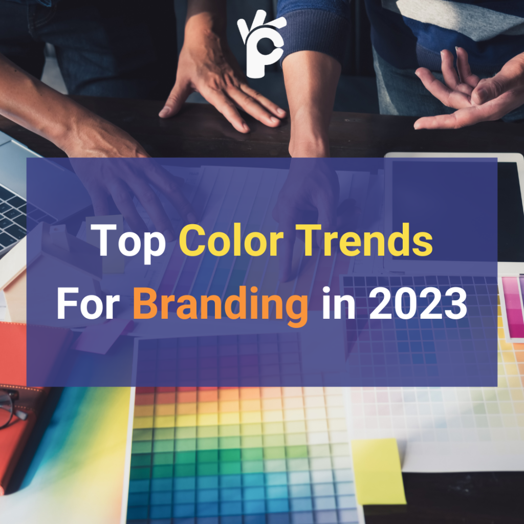
What will color trends look like in 2023, with each year bringing significant change and reformation?
But what is the significance of branding trends and colors?
color branding trends provide you an advantage in presenting your products and services to the correct clients.
Whether you tend towards optimism or realism, this year’s color trends provide great potential for creatives and companies to express themselves at both ends of the spectrum, and everywhere in between.
Of course, trends do not have to be followed all of the time, but it is useful to be aware of what they are, just as it is to be aware of the newest illustration, graphic design, and branding trends.
In this blog article, we’ve covered all you need to know about finding the hottest colors for your business this year, so you can identify your brand identity while also making it appealing to customers.
So let’s start!
Let’s explore the top 5 color trends for 2023:
- ’70s color scheme
- Monochromatic colors
- Acidic hues
- Silver chrome
- Mediterranean warmth
1. Nostalgia for the 1970s – Color Trend
Designers are drawing inspiration from the serene and cool color palette of the 1970s, with earthy browns, avocado greens, mustard yellows, and harvest golds taking center stage.
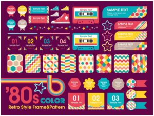
Its earthy tones help ground us by generating a sense of comfort, familiarity, and approachability, which are all qualities we all need during times of uncertainty.
Color trends from the 1970s have endured the test of time and are gaining appeal over white, grey, and more minimalist designs that formerly dominated the home space.
2. monochromatic Colors – Color Trend
Monochromatic branding is frequently polished and simplistic. A monochromatic brand color palette is made up of several hues of the same color. You begin with a basic color and gradually add shades through typeface, photos, symbols, materials, and so on.
Monochromatic colors provide your brand with a coherent design and a calming sense of tranquility. The primary color you select determines the rest of your brand’s color pallet. Choose a color that is relevant to your business and expresses the individuality of your brand.

Personal branding, skincare, and luxury branding all use monochromatic colors. The monotone style appears elevated and sophisticated.
3. Acidic tones – Color Trend
The acidic color scheme is about colors that hurt your eyes (in the most artistically attractive way possible, of course). This concept is scientifically based, drawing inspiration from the testing of acidic compounds. The brighter the color, the more acidic the material.

colors such as bright blue, bright green, fuchsia, and yellow, contrasting colors, dark blue and pink, electric blue, electric color, grey, and color fuchsia, light green and yellow, and yellow and green all fall under the category of acidic hues and can be used to create something unique and appealing to the younger generations.
These vibrant colors, ranging from bright pinks and oranges to electric yellows and greens, are ideal for making a statement. These colors command attention and produce a lasting impression, whether you’re establishing a business logo, painting a mural, or crafting a social media post.
4. Chrome-plated silver – Color Trend
The silver chrome color trend, like the graphic design trend of acid graphics, fits neatly under the moodiness and gloomy discomfort bracket.
It’s sleek, polished, contemporary, and always elegant. Silver may come in second to gold on the podium, but when used correctly in your designs, it’s a true winner.

With its warped, melted metallic aesthetic, this style is all about upending the existing quo. Silver chrome may be a beautiful reflecting tone in a pastel palette, the focal point of a sterile or futuristic design, or a rich, dramatic contrast. It’s a flexible color that sits between black and white, and its gloss reflects the colors it’s matched with.
This color trend is similar to neighboring trends such as acid graphics and anti-design since it is less about beauty for the sake of beauty and more about inciting anti-establishment expression and challenging standards.
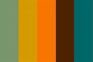
5. The Warmth of the Mediterranean – Color Trend
In addition to the greens and blues commonly associated with Mediterranean-inspired colors, terra cottas, deep reds and oranges, and clay and ceramic pottery tones are available.
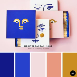
This color scheme is extremely eye-catching in 2023, with soothing subdued colors that induce relaxation.
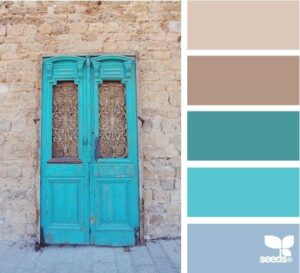
It essentially depicts the colors of that region, fusing old-school and contemporary modern hues. Classically considered Mediterranean colors are inspired by nature and span from the grounded, earthy tones of burnt umber and chestnut to the rich shades of the sea and sky like cerulean, and blue, and the vibrance of lush green vegetation. However, these colors are frequently enhanced with metallics such as copper and gold.
Whether it’s a spa website, peaceful tea packaging, or a yoga studio logo, the Mediterranean color trend is the perfect approach to convey a sense of tranquility.
Allow these smooth, soothing tones to wash over you and bring you to a state of relaxation and tranquility. Moreover, your consumers and customers will appreciate it.
Look out to The Perfectionist for more of such trending blog posts.